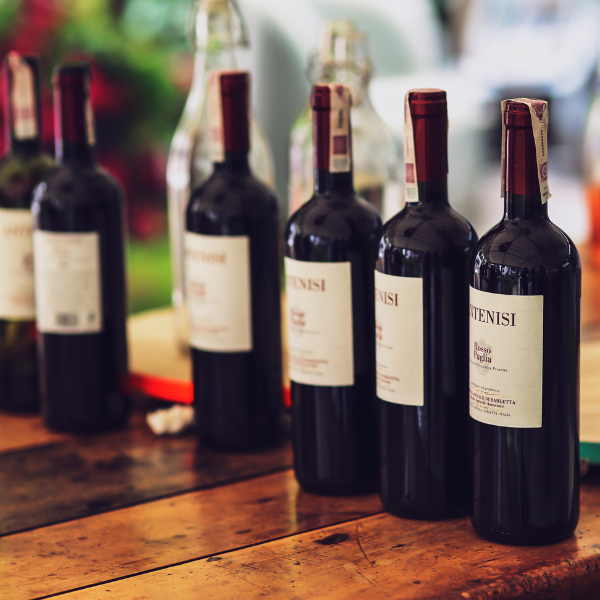
In the crowded world of wine, where countless bottles vie for attention on store shelves, the design of your wine label becomes crucial. Effective typography for wine labels not only draws the eye but also communicates your brand's story, quality, and uniqueness. For brand teams and procurement professionals, choosing the right fonts for wine labels is a strategic decision that bridges design and consumer perception. This guide explores how to leverage typography trends for wine labels to make your product stand out.
The Importance of Typography in Wine Label Design
Typography in wine marketing is more than just selecting a pretty typeface; it’s about creating an identity. Unique fonts for wine brands can evoke the tradition, innovation, or luxury that your wine represents. Effective wine label fonts can convey messages subtly but powerfully, impacting consumer choices and brand loyalty.
Consider the scenario where a new winery is entering a competitive market. The brand team knows their wine is high-quality, but without an impactful wine label, potential customers might overlook it. By focusing on wine label typography, they can create a design that intrigues and informs, standing out on the shelf and in the consumer's mind.
Choosing Fonts for Wine Labels
When selecting fonts for wine labels, consider these key aspects:
- Readability: Ensure the font is clear and legible at various sizes, especially from a distance.
- Brand Alignment: Fonts should reflect the brand’s personality—whether that's classic, modern, or avant-garde.
- Pairing: Use font pairing for wine labels to balance text hierarchy, such as combining serif and sans-serif fonts for contrast.
For instance, a traditional winery might choose classic serif fonts that convey elegance and heritage, while a modern brand may opt for sleek, minimal fonts that suggest innovation and simplicity.
Typography Trends for Wine Labels
Staying ahead of typography trends for wine labels can give your brand a competitive edge. Some current trends include:
- Handwritten Fonts: These create a personal, artisanal feel, perfect for boutique or small-batch wines.
- Minimalist Designs: Clean, simple typography that allows the brand name to take center stage.
- Bold, Decorative Fonts: Used sparingly, these can highlight special editions or unique varietals.
Creative typography on wine labels can set your brand apart, making it memorable and distinctive in a saturated market.
Implementing Professional Wine Label Design
Professional wine label design involves more than just creative typography; it requires a holistic approach to branding and packaging. For procurement teams, this means working closely with designers to ensure that the selected typography aligns with production capabilities and cost considerations.
Here’s a step-by-step approach to implementing effective typography for wine labels:
- Collaborate with Designers: Share brand guidelines and vision with design teams to ensure consistency.
- Prototype and Test: Develop label prototypes and test them in real-world settings to evaluate impact and readability.
- Refine and Finalize: Make necessary adjustments based on feedback and finalize the design.
By adopting a systematic approach, brand teams can ensure their wine label font selection not only meets aesthetic goals but also supports broader marketing and sales strategies.
Conclusion
Designing wine labels with typography is both an art and a science. It requires understanding customer preferences, market trends, and brand identity. By focusing on wine label branding typography, you can create a distinctive presence that resonates with consumers and enhances your brand’s reputation.
Ready to explore the possibilities of custom wine label design? Visit Customizable.com to discover how our solutions can elevate your brand’s packaging strategy with speed, clarity, and confidence.


